SwiftUI Containers
1. LazyVGrid#
1.1. Column Layout Algorithm#
The column layout algorithm runs in two steps. It takes the remaining width, and distributes it among the columns, similar to HStack. These are the steps to distribute the space:
- 初始设置: 首先, 系统计算出可用的总宽度, 通常是 LazyVGrid 的容器宽度。
- For each column but the last, the spacing is subtracted from the remaining width. 系统会从总宽度中减去除最后一列外所有列之间的间距。例如,如果有3列,只需要减去2个间距的宽度。
- The columns are given their width in order, but all the fixed width columns come first.
- For each column, we propose the remaining width divided by the number of remaining columns, and subtract the returned column width from the remainder. 对于每一个灵活宽度的列: a. 系统计算当前剩余宽度除以剩余的列数。 b. 将这个值作为建议宽度提供给列。 c. 列可能会接受这个宽度,或者要求更小的宽度。 d. 系统从剩余宽度中减去列实际使用的宽度。重复进行…
Each of the column types responds differently to the proposed width:
- A fixed column discards the proposed width and always becomes the fixed size.
- An adaptive column accepts the proposed width.
- A flexible column becomes the proposed width, clamped to its constraints. flexible column 会采用建议宽度,但会被限制在其约束范围内.
After all columns have a width, the grid will expand the adaptive columns. For each adaptive column, it will take the column’s width and try to fit in as many columns as possible (given the constraints).
1.2. Flexible vs Adaptive#
Flexible 列着重于分配可用空间,保持列数不变。
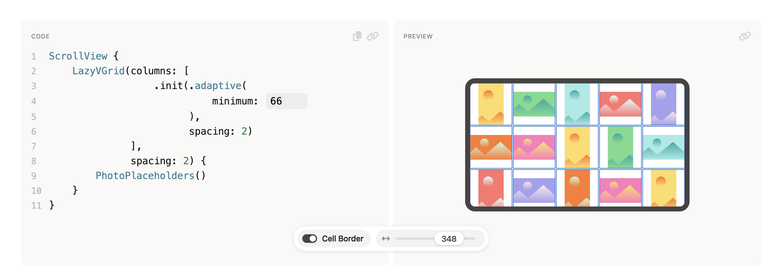
Adaptive 列着重于它们会根据可用空间自动调整列数 (一般都会指定最小尺寸), 如果空间不足,后面的 grid item 换行到下一行。
若grid里只有 adaptive 列, 则所有列均分屏幕宽度高度, 即每个 grid item 大小相同:
References: LazyVGrid - SwiftUI Field Guide
查看其他文章